In today’s era of data, the ability to break down complex information into clear, compelling visuals is a skill that sets professionals apart. Data visualization is not about creating pretty charts; it’s about telling stories, uncovering insights, and driving informed decision-making. To harness the true power of story telling, you must master the art of selecting the right visualization, adhering to design principles, and leveraging cutting-edge tools and techniques.
Choosing the Right Visualization for Your Data
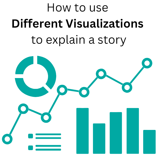
The journey towards effective communication begins with selecting the appropriate visualization method. Each dataset has its own story to tell, and choosing the right visualization is akin to selecting the perfect narrative form. For example, when comparing categorical data, a bar chart or a pie chart can provide clear insights into proportions. On the other hand, when analyzing trends over time, a line graph or an area chart can reveal patterns and fluctuations.
Design Principles for Clear and Engaging Visuals
Once you’ve identified the right visualization, it’s time to ensure that your visuals both informative, visually appealing and easy to comprehend. Design principles play a crucial role in achieving this balance. Keep your visuals clean and clutter-free, focusing on the essential elements that convey your message. Pay attention to color choices, ensuring they are consistent and meaningful. Utilize whitespace effectively to guide the viewer’s eye and emphasize key insights.
Tools and Techniques for Data Visualization
In the realm of data visualization, having the right tools at your disposal can make all the difference. Leading tech giants like Salesforce, Microsoft, and Amazon Web Services (AWS) offer robust platforms equipped with powerful visualization capabilities. For example, Salesforce’s CRM Analytics empowers users to create interactive dashboards and explore data visually, driving actionable insights. Microsoft Power BI provides a comprehensive suite of tools for data visualization, from simple charts to advanced analytics. AWS offers services like Amazon QuickSight, enabling users to build stunning visualizations effortlessly.
Mastering data visualization is an essential skill across industries. By choosing the right visualization and adhering to design principles, with the right tools and techniques, you can unlock the full potential of your data and drive meaningful outcomes.
Our Data and Analytics team are aware of the importance of breaking down data to best understand trends, inflection points and key insights that stick forcustomers. We provide an in-depth business analytics offering of which one of the components is data visualization. So, let’s embrace the art of data visualization and embark on a journey of insightful communication and informed decision-making.